Mansfield Park by Jane Austen

The House of Illustration in collaboration with The Folio Society have an annual book illustration competition. The book we were invited to make sample illustrations for this year was Mansfield Park by Jane Austen. The entry requirement was for three illustrations and a cover design for a future Folio Society book. 

This was my entry:


All Fanny yearned for was her home.


 I began with a very "straight' approach, but halfway through I didn't feel happy with what I'd done, so I began a process of deconstructing, which gave me far more interesting results! 


 Fanny was sad as she watched Miss Crawford flirt with Edmund.


All of the images I've made comprise of paper and fabric collage. 

 
For the first time Fanny felt herself an equal to her cousins.  


Lastly, we had to show a design for a cover, the type and format of which were already designed. 


All copyright, Rebecca Sutherland 

Year of the Rooster 2017

It is the year of the rooster and the Royal Mail have published their smiler for the lunar new year. 


Each page includes a set of stickers which depict five elements, water, wood, fire, earth and metal.


These images were made from cutting coloured paper and arranging them on a background. 


Here's the Royal Mail shop link to the smiler

The Philatelic Bulletin - Feature

The January article about my work in the Philatelic Bulletin.


Squirrel Christmas Card

I was thinking about making this card for a while. It was only when I sat down to actually work out the idea in paper that it appeared as a bushy-tailed squirrel holding a nut. 


Squirrel - Christmas 2016


Getting it to look right was tricky because of the angles of the folds and the different colour of the tail.  I ended up making around 18 trial versions until I was happy with this one.

When the construction was right I ordered the paper I needed, along with square envelopes of the correct size. I then cut the shape out, scored, folded and used a ticket punch to make the eye.


Working it out

Making the cards
                                                                                 
Shelf inhabitant
Here is a link to some of my previous papercut Christmas cards.

Merry Christmas!

Christmas tree decorations as gifts

This is a bit of a Blue Peter blog.

Two friends from art college and I have been exchanging Christmas tree decorations as presents for years. This leads to the gaining of some rather extravagant and delightful tree decorations that we probably wouldn't buy for ourselves. It also cuts the stress of present buying and delivery.

Birds and eggs in nests in boxes

This year I thought it would be nice to share what I'm sending here.
I found the birds and eggs in a sweet little shop where I had the idea to package them in nests.
I tend to save everything I think is interesting or useful, so I already had the chocolate and Turkish delight boxes. 

I shredded some packaging paper for the nesting material. The chocolate box needed its label covering. I had some Japanese paper with trees which I cut to the right size and glued in place. The Turkish delight box already had a nice label so I used some scrap-booking birds I had on a sheet bought years ago. 

Lastly I added a little label to personalise the gift.

 
Materials I used for the packaging

Shortlisted for AOI Awards 2016

This year I bit the bullet and entered a project I did nearly two years ago into the AOI awards 2016.


A few years ago I posted some of my linocuts on Twitter.  I also blogged about them and shared them on my website, but it was the tweet that was seen by a designer and it got me this job.

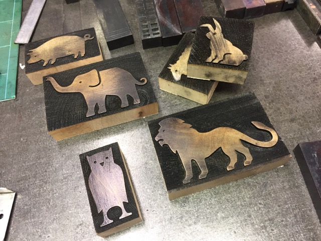
Sadly the end result did not emerge as a product, so I really wanted to get something out of it. The visual pack shot was always very popular when I took it around design agencies, so I decided to enter it into the annual competition at the Association of Illustrators. Luckily it was liked there too and I was very honored and delighted to be shortlisted by them.

The exhibition of the winners and the rest of the shortlisted is currently on at the Somerset House.
Details can be found here.

Read more about this project here. 
 
The linocuts:


London Map for Ottolenghi


Ottolenghi are a company with a series of very successful delis, and restaurants dotted around the centre of London. Their food is "a distinctive mix of Middle Eastern flavours – Syrian, Turkish, Lebanese, Iranian, Israeli and Armenian with a Western twist".

This year the company issued an open competition to design a premises locator summed up within one image for a postcard. And I thought it would be fun to have a go - you never know where these things lead to. So I began work on my own entry.

I have used food such as a gherkin and a cheese grater (two nicknames for some of London's newer buildings) to insert a bit of humour in the map of the capital. Sadly, it was not eventually chosen by the company, but I did see the Ottolenghi owner, Yotam Ottolenhgi's reaction to my entry "that's just brilliant", which is a great compensation.

Here are some details of the map.  


The Belgravia side of London

The East End including Islington and Spitalfields

The West End Including Notting Hill and Nopi in Warwick Street


South London

Process
 
I planned the image using a map of London as reference


When the drawing was complete I scanned it into the computer

An early colour option.
I very much enjoyed making this map.

Year of the Monkey 2016 - The Royal Mint

These quirky roundel designs for the Royal Mint's Lunar New Year presentation packs are something I've been honoured to illustrate for the past few years. The Graphic device for each animal provides a lavish border for each special issue coin.


Here is the initial sketch developed to the finished doily. It takes me about one day to design and one day to cut the intricate patterns from one piece of paper.

Initial Sketch

Black and white version
The image I piece together on the computer.  

Above is the level of visual that goes to the client for approval.


The final cut out


Below are the little stamps used as detail on the pack. I make these using a scalpel cut into ordinary pencil rubbers.


You can buy this Lunar Year of the Monkey presentation pack from the Royal Mint here 

Graphic Design was by hat-trick. 

These are two previous roundels I have made for the Royal Mint. The blogs for these are here for 2014 Year of the Horse, and here for 2015 Year of the Sheep/Ram. 
  

Year of the Horse 2014

Year of the Sheep 2015
 

Animal Wood Blocks


When I take my portfolio to designers they often refer to my handcrafted work as being refreshing and a joy to behold. My guess is it's a relief from graphics and illustrations generated digitally. In truth although much of my work begins as a drawing it nearly always relies on the computer at some stage in its development. So I tend to see it as a tool in the box rather than the source of my creativity. 
 
This job relies on the combination of both.


In colaboration with Kelvyn Smith at Mr Smith's Rules, a Letterpress workshop, Jim Sutherland had already made some very nice prints. His next idea was to make a book based on animals and the noises they make, but mixing them up, so the elephant goes EEK! Jim asked me to design the animals he'd chosen and we had them laser cut from wood to the depth of standard traditional type. This meant they could be inked and printed alongside the letter type noises. 


When the drawings were finished I traced them in pen and scanned them to make a vector illustration. I do this as it gives me a little more control over the line. With size details the typecutter can then work from a pdf of the images to create the 3D pieces.
 
When they've been printed several times the animals look like any other piece of type.

Here are a few of the proofs in laid out in the workshop:


Jim's book is still in production.